Friday, September 24, 2010

Using a Commercial Steamroller to Print

The Cryptogram, 2010 woodcut 16"x 28"
It is that time of the year again at the(SFCB) San Francisco Center for the Book's annual Roadworks:Steamroller Prints street fair. I have participated for the past 3 years as an artist, and this year I was invited to be one of 18 contributing artists to produce a linocut for a portfolio of special prints with the theme of La Loteria. I am excited to be chosen, but the theme does not immediately appeal to me, so it will take some time to develop the right image. I must consider using a number as part of the SFCB requirements, and how it will look on the final piece. Coming off several new works of art, I decide I am going to enlarge a portion of the artwork titled "The Cryptogram" as inspiration.

Since I am developing an image for a theme, I have to be creative in the way I can apply my techniques, maintain consistency in the portfolio, and comply with the requirements. I have several new punches that I am continuing to use, and I am working on linoleum as wood will not support the weight of a commercial steamroller when printed.

The SFCB  Roadworks: Steamroller prints is exactly what it sounds like. A commercial steamroller is used as a press to print hundreds of artists work in the middle of the street. These prints are sold to benefit the SFCB. So just how do they do it? Well, here is a simple demo.....
9 lino plates are inked at one time
The lino plates are arranged in the middle of the street on a wood bed, and mylar with predetermined spaces for both plates and paper

close up of: San Francisco

The artworks are covered with paper

Blankets are used, just like a normal printing press to protect the paper

Finally, they fire up the steamroller and drive right over

The artwork is revealed to the onlooking public,..oohs and aahs follow...

The prints are left to dry and sold.

Thousands of people attend each year to watch

Prints for Loteria on the top row, and other various artists works on the bottom


My artwork has to conform to La Loteria, but I still have artistic license to work within my style. I have chosen “The Moon” as my title and the number 0(zero) to make use of the natural circle a punch makes. This way I can concede to the guidelines without destroying my artwork. I really like the idea that “The Moon” can be translated in many ways as the punches produce moon shapes, and the subject matter is a butt, otherwise know as a moon in slang terms. 

While working on the linoleum, I am aware that this block will only be printed in one color, so the punches are used to the best of their ability to show a direct light source. I do this by overlapping patterns the punches make. This work is very loud, with the hammer striking the metal punch, and the work moves slow, as my ears begin to ring after an hours worth of work. After 3 days i have something to print.
State 1: The Moon, 2010, 12"x12"
I am a little unhappy with the results; one, I made a punch at the very bottom between legs that I did not intend on doing, and two, I am uncertain an actual butt can be clearly deciphered. I continue to work for 3 more days adding small punch marks here and there until it looks like the butt is covered in diamond dust and glowing from the light of a full moon. It is RTP, or ready to print.

State 3 printed in dark blue: the finished image


It is time to turn in the lino-plate so it can be editioned, and sold with the portfolio or as an individual piece at the SFCB.

Each year I look forward to participating in this event as an artist, that brings relief printmaking to the public right on street.

Discovering new creative inspiration by revisiting and updating earlier works


Beagle in the House!

Introducing Gilly, our new beagle. She was rescued by way of http://www.norcalbeagles.com/ and I am printing/bloging with a new partner now.


I have been stuck in the creative process for new material and new ideas for content as well as developing my woodcutting technique further. This past week I found both. I looked at some older artworks as potential subject manner due to the fact my carving techniques are producing different looking images than previous artworks. The difference is made by a number of reasons: I am using 2 plates to print one image which allows for a richer and deeper look because the layered inks can provide opaqueness or transparencies as intuition dictates. I am also using 4 different sized circle punches, and 3 different awls, which provide an infinite number of patterns.

I found a great new inspiration from looking back at my sketchbook from the late 1980’s, when I used Van Gogh’s Self Portraits as subject matter. I thought of the ways that Chuck Close has used the same image presented in a different manner each decade, and the way that artists build a body of work. Several artists have changed their painting style as their inspiration grows, but several make this change by using the images of artworks from their past to update them with new style, or technique.

In the past, I thought some of my older artwork had lost its relevance because my focus on printmaking had changed, my style had changed, and my subject matter changed. These so called relics of my past are perceived in 2 different ways, either junk from your past or still loved but where is the present connection to your current artwork? By recommitting myself to some older images, I can build a connection to my past through my present artworks. I am going to do a number of new artworks based on older pieces. I have decided to take only small sections, mostly portraits from previous artworks, enlarge them, and see what images will inspire me to create whole new artworks in my current working style. For subject matter, I choose the Van Gogh Self Portrait again. I made several paintings in the late 80’s and early 90’s.

I started my drawing dissecting the image and allowing my present mind to forget all the previous times I used the same subject manner. I convinced myself that any new approach to an older image will produce a completely different piece, because stylistically and artistically, I have grown.

This is my printing area, to the right is my drawing.

In this new print I have expanded my carving in one different way. I am no longer isolating the type of cuts on each plate (previous work included isolating white line cuts to one plate and the second one, a punched plate). I am now combining both cutting marks on both cutting plates. I have reduced my printing to hand painting each space for each plate printed. In order to achieve a final look, I have printed several spaces overlapping each other, and left some blank on each plate in order to emphasize depth, texture, and color.
Detail of print showing how color is layered

Detail of print in progress

detail of plate #1 
My printmaking process is all painting. I am mixing colors with a brush and palette, and I am printing with my trusty old wooden spoon to use as a baren. I am focused on making sure there is a strong light source present, how to add contrast where some colors will be overlapping, and how the patterns that are carved will produce different visual effects. I am concerned with how opaque and transparent colors will play out on the final piece.


On this print I left both plates UN gesso-ed/un-fixed and this may have been a mistake, because the ink is adsorbs into the plate which means I have to paint a smaller area to print, and adds time. However, the un-fixed plate also produces a softer look, and I can still get a real hard edge by applying the ink while it is still pretty stiff.
Stage 1

Stage 2


Stage 3, Plate 1 is printed, time to start printing the second.

Detail after first plate is printed

Stage 4

Stage 5, and completed


My excitement is contained by the number of hours to finalize one print. So far I have printed 3 in a 3 day period working about 6-8 hours on each piece. The slow process allows me to take an analytical look as the print begins to develop. This slow and time consuming practice appeals to me more than creating an edition of several exact copies. I am now producing much larger and more technical, more concentrated works and producing a smaller number of unique prints from each plate.

BTW: Gilly slept the whole time at my feet, what a good girl!

Sunday, August 1, 2010

Develop a Vacation Art Studio


For many years now, I have packed up several art supplies to bring with me on vacation to just pass the time by with no specific purpose of developing any of the ideas into finished works. Over the years that has changed from a few simple drawing materials, or a small woodcut, or a travel easel, to a packed car full of way too many supplies. I have even gone to the extent of taking along a portable or desktop printing press(about 100lbs.) to get my artistic energy working. A lot of artists will take a sketchbook, a camera, or a watercolor box since they know these items are small, and can be packed away easily for any trip. I tend to over pack on vacation as I know I sometimes have no idea what will inspire me or what materials I want to use. This time, I planned on woodcut printmaking only and I managed to pack everything I needed into a small box, and an artists portfolio case, minus the large paper and actual wood woodcut plank.
My most recent vacation entails renting a small studio house half way up the hill, and along the northern Californian coast, overlooking the famous Russian River. This peaceful and relaxing spot has allowed me to focus on one print over the next 6 days. I planned for this at least a week ago, and managed to carve or cut my latest work(see previous blog) prior to setting out on my trip. Therefore, I only needed the printing end of my studio. However, my work was large and I would need a fair amount of space and a great setup spot to finish.
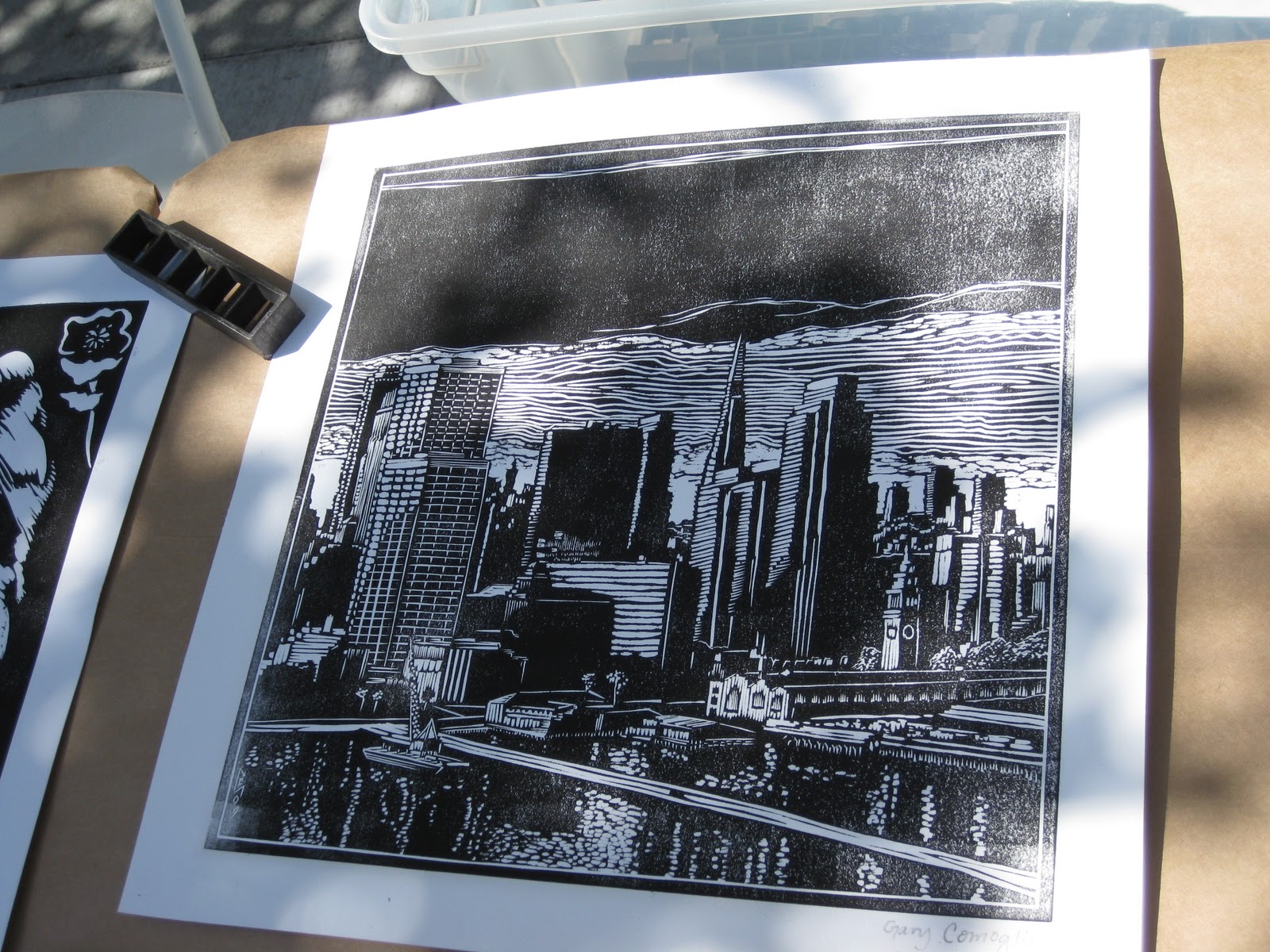
When working on larger pieces, I can not stress the importance of having the right equipment for the job at hand. I can not bring a 600lb. press with me, nor is it practical to bring massive inking rollers. Those are the right tools to produce a woodcut large print, but there is no practical means so I have opted for the full manual process using hand tools only. This will add time, and inconsistency in some of the printing depending on how I manage. I have a 2 plate woodcut print to finish printing in 6 days, and 5 sheets of 25”x39” Japanese mulberry paper.
Day 1: on the first day I get right down to work claiming the sunny corner where the breakfast table is, and quickly arrange all the furniture to suite my purpose. My goal is to print 3 different colored prints of the first plate. There are many quick lessons to learn when working large, and little time to make big adjustments. I am not to specific about the color choices I am printing other than I want one or 2 yellow copies and one or 2 peacock green copies.
Inking a large plate like this will take about 3x to 4x more ink and about 5x more time to lay the ink to the surface(My work is just under 30”x18”.). The important steps here is make sure you are adding enough printing medium: Extender to thin out the ink, and Retarder to allow the ink to dry at a slower than normal rate(use about 1/5th of total ink used).
Once the block has been inked, The paper is gently pressed against the wood and flattened out. Some papers tend to warp or wrinkle, make sure your paper is flat before using any pressure to prevent creases. When I use a hand pressing method, I choose an old stand-by, the back end of a large wooden spoon that has been used for pressing small blocks for many years. The challenge here is making sure you continue with even pressure and the ink does not dry up on you while you are pressing the piece, or stick to the surface and tear the paper. It takes at least 10-15 minutes to fully cover the plate by the hand pressing method, and I’ve had to stop at a few points near finishing it because the muscle in my shoulder was burning. I am reminded of the master woodcut artist John Buck’s quote, “it is not hard work, it just takes time.” How true. These words kept me going and working through “the burn” of aching muscles. Even though my muscles were soar, the task at hand just needed time to develop the final image. Over the next few hours, I repeat these steps 3 more times, and come away with 3 good prints: one in yellow-gold, one in mint green, and one in peacock green. My wife convinced me to print a 4th copy after seeing the print in peacock green, and she suggested black to add more contrast of the woodcut work. I decided this was a great day because with the few successful prints, I am also walking away with one print in red-black that I never intended on printing,…like an added bonus. I clean up and into the hot tub to soak those soar muscles.
Plate 1 in red black

Day 2: I don’t have a completed plan in my head for the way the second plate will be printed over the top of the first. I know the method, and the practice, but seeing a finished piece in my head is impossible right now. Everything is very immediate, unplanned, and basically a test of both woodcut blocks. The second day work goes very slow as the process for printing each color is very time consuming. I manage to finish about ¾ of one print on the second day.
Day 3: I finish the first print and have inspected the final image and how both plates interact with each other. After surveying the image closely I notice that the first plate does not show itself as the second plate does. Its dominating presence makes the print look very regular to me. While I am happy with the final printed results, I am stuck for the next print on how to make more of a balance of each printing plate. I immediately notice in the first print how the 2 figures and their color dominated the image, and looked overworked, and also destroyed much of the beauty of the first plate. Finding the balance for the second plate will require leaving more of the first block to show itself. I set up the next print with the paper only so I can begin at any moment.
Day 4-5: Over day 4 and 5, I thought about color placement a lot, and how I can use the beauty of each plate to balance each other in a finished work. I started the printing on the peacock green proof, and I have completely reversed my normal method of working from light to dark, to dark to light. I imagined that I would be able to see the print develop better using darker colors first, and it will allow me to choose which elements of the first plate to be left alone and shine through on their own. Since I am printing less of the second plate, the print does move quicker to completion, but I have to stop at several points and second guess what I am doing and if it will work in the end.
When is a work finished? I asked myself this question several times while examining the print and in the action of printing it. Do I need to print more? Do I need to make colors richer, etc..etc. These questions let me walk away from the work and leave it until morning.
Day 6: Very little work was added, just a few small spots to make some of the existing colors a little stronger.
The working process of printing allowed me to see what can be done in the middle of completing a work no matter if it is going bad or good. It also allowed me to mentally develop different carving techniques for future works…..How did that happen? While printing I was able to see what the final print would look like or how the plates may overlap each other in different ways, so now, I can emphasize these ideas, make changes, or fine tune them for the next work.

Always be thinking about the next work…..